Alaska Airlines
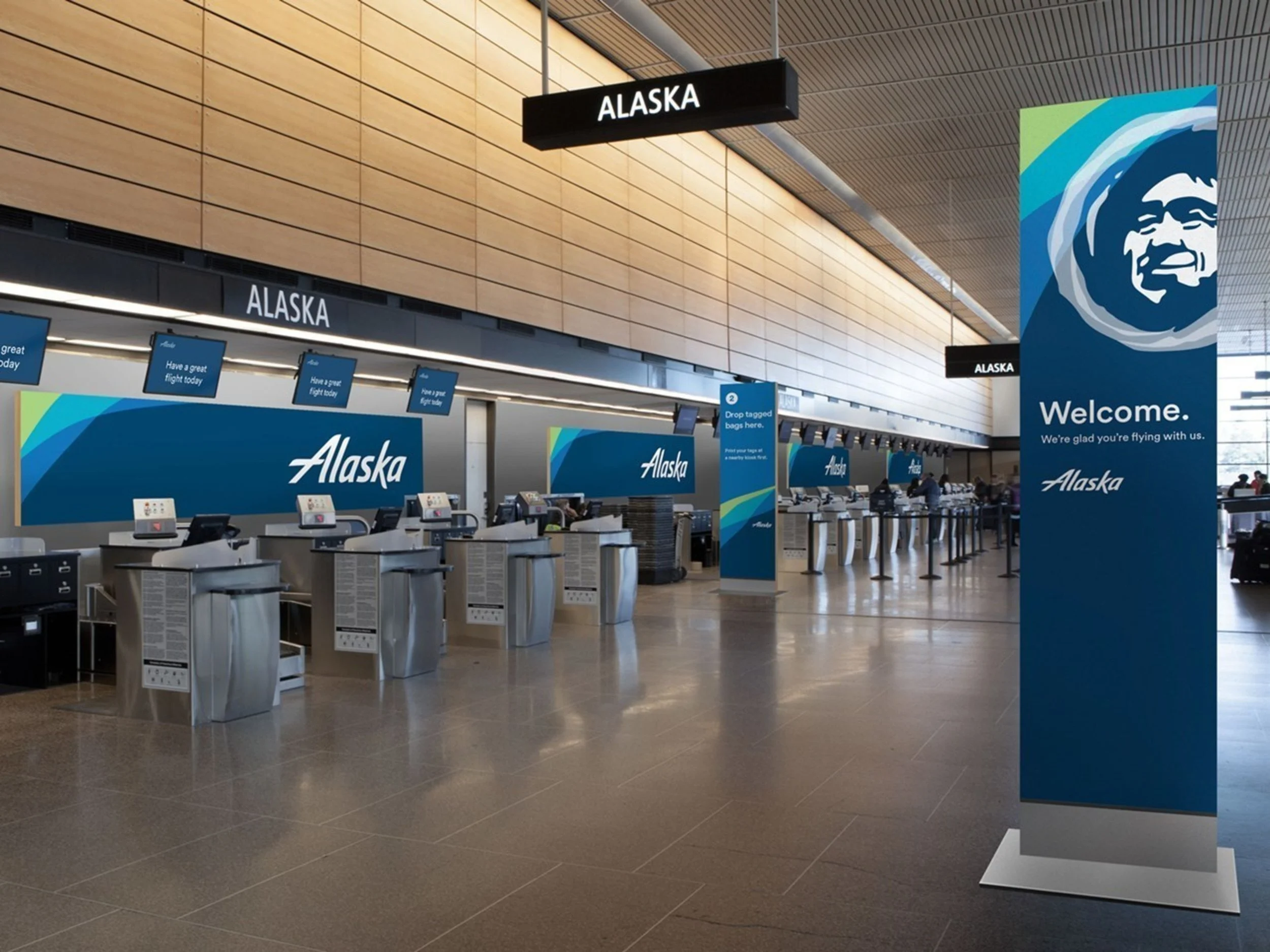
Alaska Airlines hoped to unveil a new logo with a substantial update across all touchpoints—virtual, on-plane, and in-airports. They sought consistency and familiarity in visuals and practice, with reduced clutter, a more straight-forward customer wayfinding journey, and increased access for passengers. Our team first worked to analyze the existing conditions in airports all over the continental US and across Alaska. These findings informed the structure of the new customer journey, one that was flexible to scale, environment, and gate flexibility requirements of many airports. We created a bold, highly consistent wayfinding visual system that celebrated the new visual language and reiterated customer destinations through color. Prior to implementation, we hosted a full scale mock up of the environment for the Alaska team to evaluate, soliciting feedback from the C-suite to desk managers alike. The new program made its debut at Seattle-Tacoma International Airport in January, 2016.
Strategy/Analysis
Design
Copywriting
Project Team
Work Completed w/Gensler
(designer on 5-7 person team)
Logo + brand colors by Hornall Anderson


