Pier 27
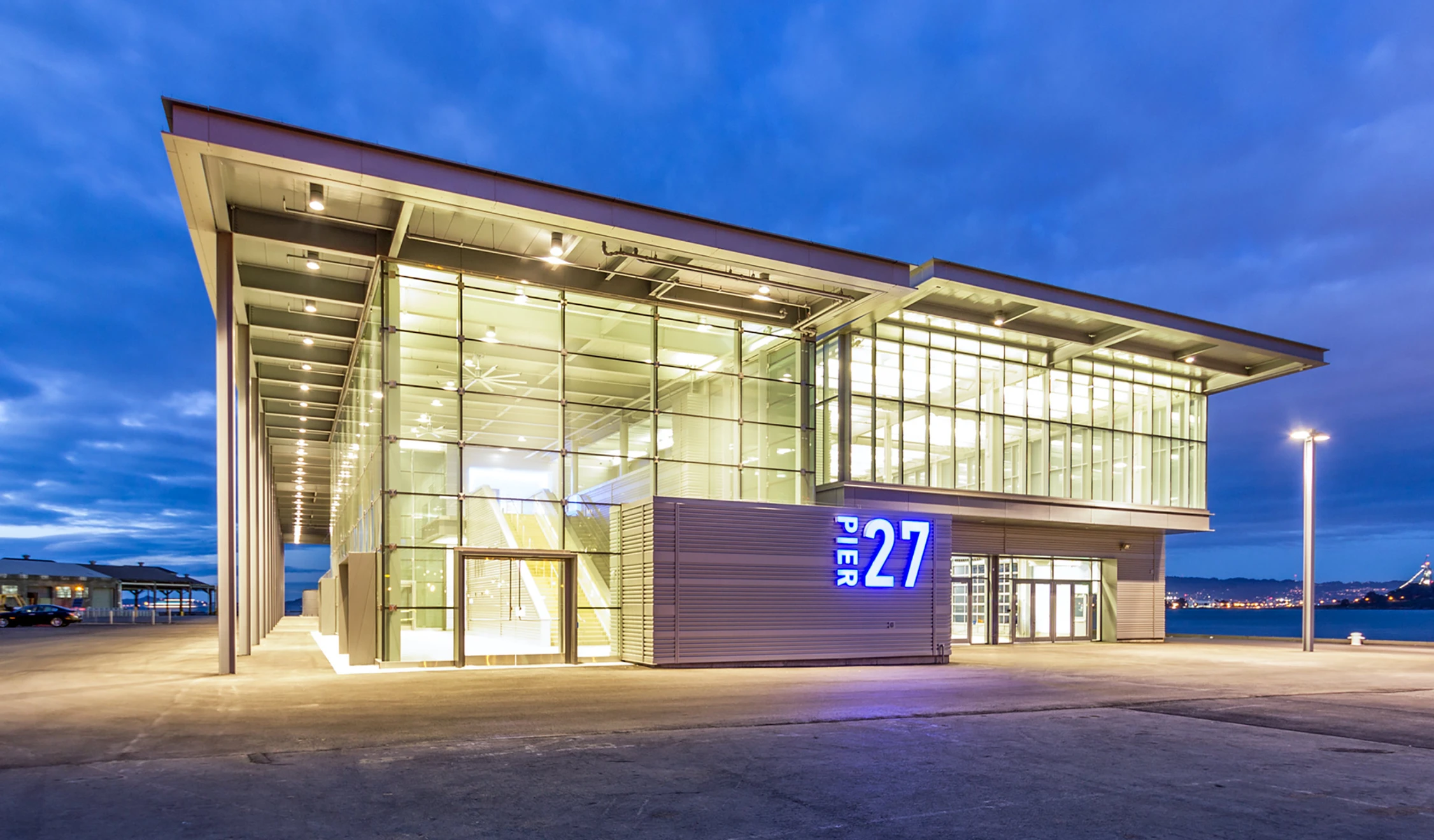
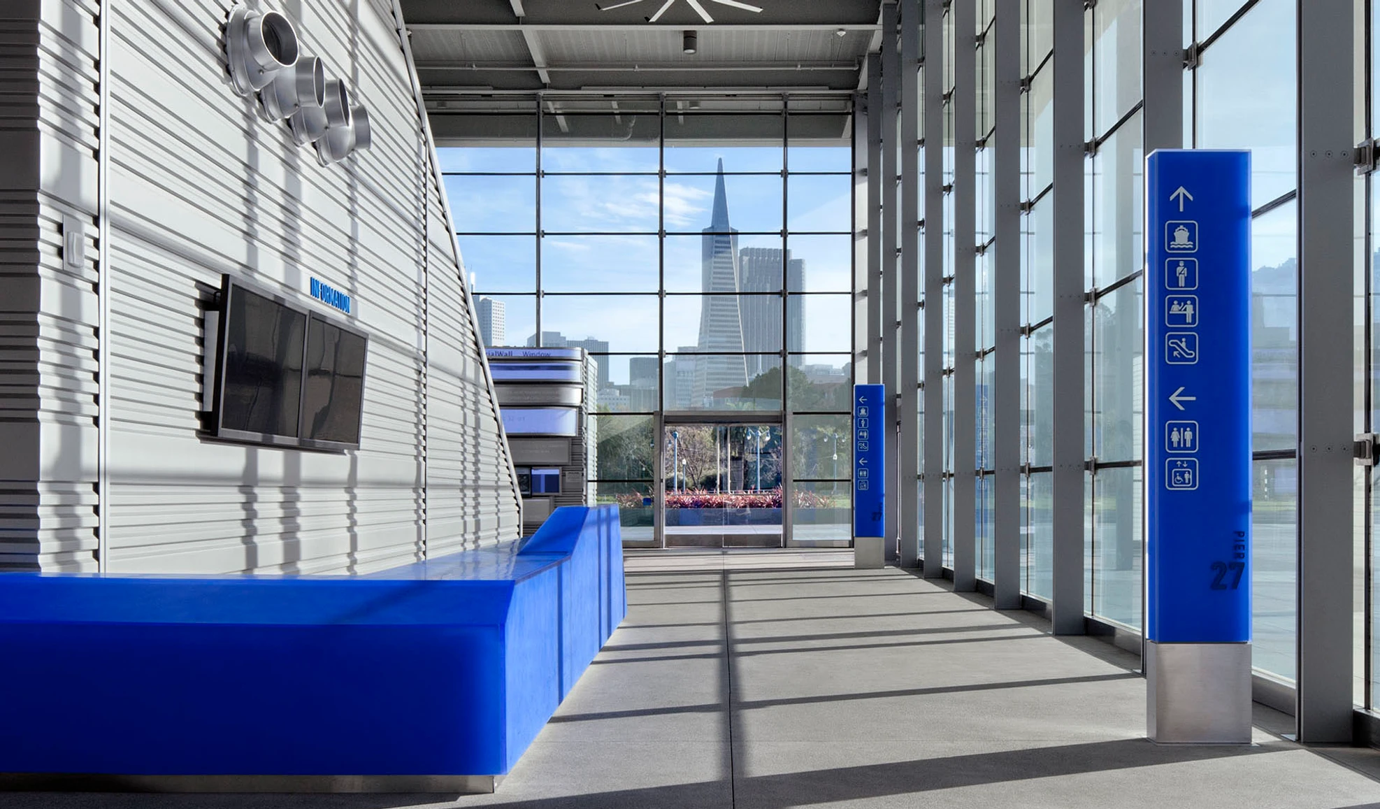
Pier 27 was designed with two distinct phases: first, as ready home for the America’s Cup, and later, to be fully developed into a deep-water cruise entry. Our team developed the identity and sign program for the newly renovated Pier, which included a flexible logo and strong use of the blues and greys of the building itself. The wayfinding system includes a series of fixed slender pylons, both in the public lawn and in the building itself. These pylons are blue beacons, serving to identify the building and help users navigate, with an icon-forward system on the interior. The larger sign program also includes flexible and moveable messaging panels for use in quickly changing messaging needs for embarking and disembarking passengers, and a large scale Port of San Francisco sign that serves to welcome visitors approaching from the water.
Design
Construction Admin.
Project Team
Work Completed with Clearstory SF
Client: Port of San Francisco
Architect: KMD Architects/Pfau Long Architecture
Fabrication: Priority Architectural Graphics
Photography: Jeffrey Galbraith, David Wakely


